South San Francisco, CA February 2, 2017 Submitted by Juan Raigoza, SMC Controller Compiled by KQED Science

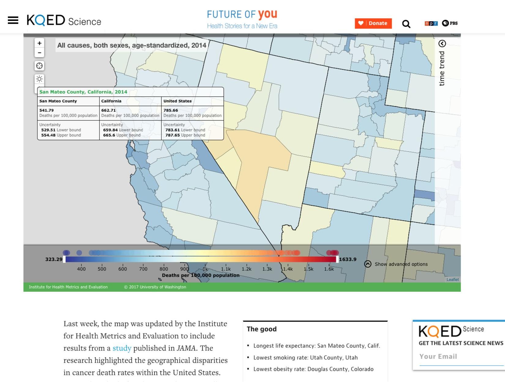
Studies show the longest life expectancy is found in San Mateo County, Calif.
REBROADCASTED FROM Fatality Rates in Every U.S. County By Jon Brooks JANUARY 31, 2017
Want to know who dies where from what? Behold the interactive U.S. National Health Map, which categorizes each and every U.S. death into each and every county. The map can tell you which areas of the country have the lowest life expectancy, which suffer the highest rates of binge drinking or suicide, and enough other information to satisfy even the most voracious consumer of morbidity and death data.
Last week, the map was updated by the Institute for Health Metrics and Evaluation to include results from a study published in JAMA. The research highlighted the geographical disparities in cancer death rates within the United States. Researchers looked at the more than 19.5 million cancer fatalities in every one of 3,144 counties from 1980-2014, finding that while the country’s overall cancer mortality rate decreased by about 20 percent, 160 counties actually logged an increase.
That’s but a small sampling of the findings, which gave us a good excuse to revisit the map, launched in 2013 with a look at mortality rates by county. More studies and more numbers followed.
Just last month, researchers published a paper looking at causes of death by county, from infectious diseases to substance abuse to suicide and violence. On that last item, Alaska suffers the highest rate. (The Kusilvak Census Area, population 8,000, is off the charts at 65 deaths per 100,000 in the category.) The rates in South Dakota counties with Native American reservations were also extremely high.
In terms of life expectancy, according to the 2013 data, no one had it worse than the men of McDowell County, West Virginia. A male born there in 2013 could expect to live about 63-and-a-half years, just a little longer than the average person in Haiti, and trending in the wrong direction to boot. Using the map, you can see life expectancy for those born in McDowell County in 1985 is live several years longer. Bernie Sanders has cited the low life expectancy in the county to illustrate disparities in health care. In 2013, Sanders invited a county resident to testify before the Senate Subcommittee on Primary Health and Aging.
McDowell County has high rates of obesity, diabetes and smoking, as of the last years analyzed for each. These statistics are included in the dataset for “Risk factors,” where you’ll observe some big regional differences when it comes to vices that kill.
For instance, the least amount of drinking occurs, not surprisingly, in predominantly Mormon Utah County. But right across state lines, Colorado residents are frequent imbibers. In terms of binge drinking, the northern states of Wisconsin, Montana and North Dakota have it bad. Head due south, you’ll hit a diabetes belt along the Texas-Mexico border, and one covering Mississippi and Alabama. In Kentucky, there’s a smoking problem–not to mention, consequently, the nation’s worst lung cancer mortality rate.
The stats also tell some health history. Here in San Francisco, for example, under”Dataset: Mortality rates and Cause: HIV/AIDS and tuberculosis,” you can see the death rate increase more than five-fold between 1980 and 1995, when the AIDS epidemic raged, followed by a sharp decline as antiretroviral drugs were introduced.
In December, researchers published a paper looking at causes of death by county, from infectious diseases to substance use to suicide and violence. Regarding that last category, Alaska had the highest rate, with the Kusilvak Census Area, population around 8,000, off the charts at 65 deaths per 100,000 from suicide or violence. South Dakota counties with Native American reservations also suffer extremely high rates.
The IHME’s Kayla Albrecht says researchers will update the map as future studies are completed, and upcoming papers include break ing down causes of death into more specific categories.
The IHME is funded in large part by the Bill & Melinda Gates Foundation and the state of Washington. The website will give you access to more data visualizations, research papers and how the institute’s data is being used internationally.
###

JON BROOKS
JON BROOKS
Jon Brooks is the host and editor of KQED’s health and technology blog, Future of You. He is the former editor of KQED’s daily news blog, News Fix. A veteran blogger, he previously worked for Yahoo! in various news writing and editing roles. He was also the editor of EconomyBeat.org, which documented user-generated content about the financial crisis and recession. Jon is also a playwright whose work has been produced in San Francisco, New York, Italy, and around the U.S. He has written about film for his own blog and studied film at Boston University. He has an MFA in Creative Writing from Brooklyn College.